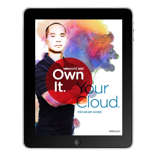
VMworld is the largest event in the cloud computing industry with 19,000 in attendance.
We created a flexible, yet coherent visual program, that turned the Venetian into a unique, vibrant and compelling event experience across all touch-points–from name badges to websites, from signage to the conference guide, and everything in between. The unique branding resonated with VMware's customers and helped turn attendees into VMware brand advocates.
Larsen’s bold branding for VMworld 2011 clearly struck a chord with the target audience — from the directive event theme “Your Cloud. Own It.” to the towering personas to the colorful cloud imagery. The theme used commanding language to empower the audience. The personas were regular people, scaled to super-hero size. The cloud imagery was rich, three-dimensional, and one-of-a-kind, created by photographing ink in water. The overall effect was powerful, confident, and larger-than-life, much like the event itself.
“The event was professional, bold, smart, and just looked amazing. I wanted to thank you all for making this year's theme and creative the best ever.”
– Kellie Beakey, Director of Corporate Events, VMware
“It was a delight to work with the Larsen's team energy and creativity! They were thoughtful and responsive team partners during the process, and everyone enjoyed the engaging imagery.”
– Carol Sconzert, Graphics Producer, Jack Morton Worldwide
Project: Visual Look + Feel for Annual Conference
Client: VMware
Agencies: Larsen Design and Jack Morton Worldwide
Team of Seven: VP of Creative, Senior Designer, Two Designers (including me), Account Manager, Project Manager, Writer, and Production Artist
Function: Designer
Role: Logo Lock-ups, Style Guidelines, Attendee Experience, Signage, Web Banners, and Look Book
Process
Final images
STYLE GUIDELINES
Our visual theme makes the attendee the hero with positive, assertive portraits that our audience can identify with. The vibrant clouds suggest imagination and flexibility, qualities that VMware encourages and facilitates. Strong fields of bright color add energy and boldness. The rules for using these elements are flexible enough to allow a wide range of expression and to suit an equally wide range of applications.
Event collateral
Look book
Event photography
FOrum 2012
After winning over VMware with a successful VMworld 2011 event, Larsen developed the look and feel for Forum 2012.
We applied this visual language to a cross section of materials, including an email header, conference guide, pop-up banner, mailer, and frame stand signage. These examples helped drive the implementation to all other event components, which was done by the VMware team.
Unlike VMworld, this event had to integrate the company's brand system, which included the typography, color palette, illustration style, and graphic elements. After taking that all into consideration, we differentiated Forum by creating unique lock-ups and illustrations with a whiteboard hand-drawn style. To set the black and white photography apart from stock imagery, we art directed a photographer to take these genuine portraits of IT people. Finally, we carefully integrating all these elements to create an illusion of engineers communicating their thinking, process, and solutions.
Project: Visual Look + Feel for Annual Conference
Client: VMware
Agency: Larsen Design
Team of Five: Senior Designer, Designer (me), Account Manager, Project Manager, and Writer
Function: Designer
Role: Logo Lock-up, Imagery, Signage, Conference Guide Cover, Email Template, and Web Banners


