
Epocrates is the #1 medical reference app. More than 1 million healthcare providers trust Epocrates in the moments of care, because we support clinical decisions, save valuable time, and keep the focus on patients.
Epocrates delivers the most current safety, diagnostic and treatment information, right when you need it. On average, providers report saving 20 minutes or more a day with Epocrates. Because you can access Epocrates intelligence instantly, your attention stays where it belongs, with the patient.
In 2015, the UX team's goals were to increase engagement and improve the brand equity. In order to do this, we needed to create user awareness of content that already exists and create a better user experience. We also wanted to become a clinical informational app, instead of just being known as a drug reference. With that said, we refreshed the Epocrates brand and the home screen to align with the new athenahealth brand that launched in December 2014. We also improved search in order to increase awareness and educate our user about our capabilities by surfacing related content in the search results.
STRATEGY
Our business value proposition at Epocrates is to move from being known as a reference tool for knowledge to an intelligent tool for decision support. Epocrates is currently great at condensing and curating information, but eventually we want to be known for synthesizing information in order to help doctors take action in the decision making moment.
Product: Home Screen Refresh and Search
Company: Epocrates
Platforms: iOS and Android
Date: 2015
Function: User Experience Designer
Role: User Research, User Testing, Interaction Design, Visual Design, Specs, and Assets

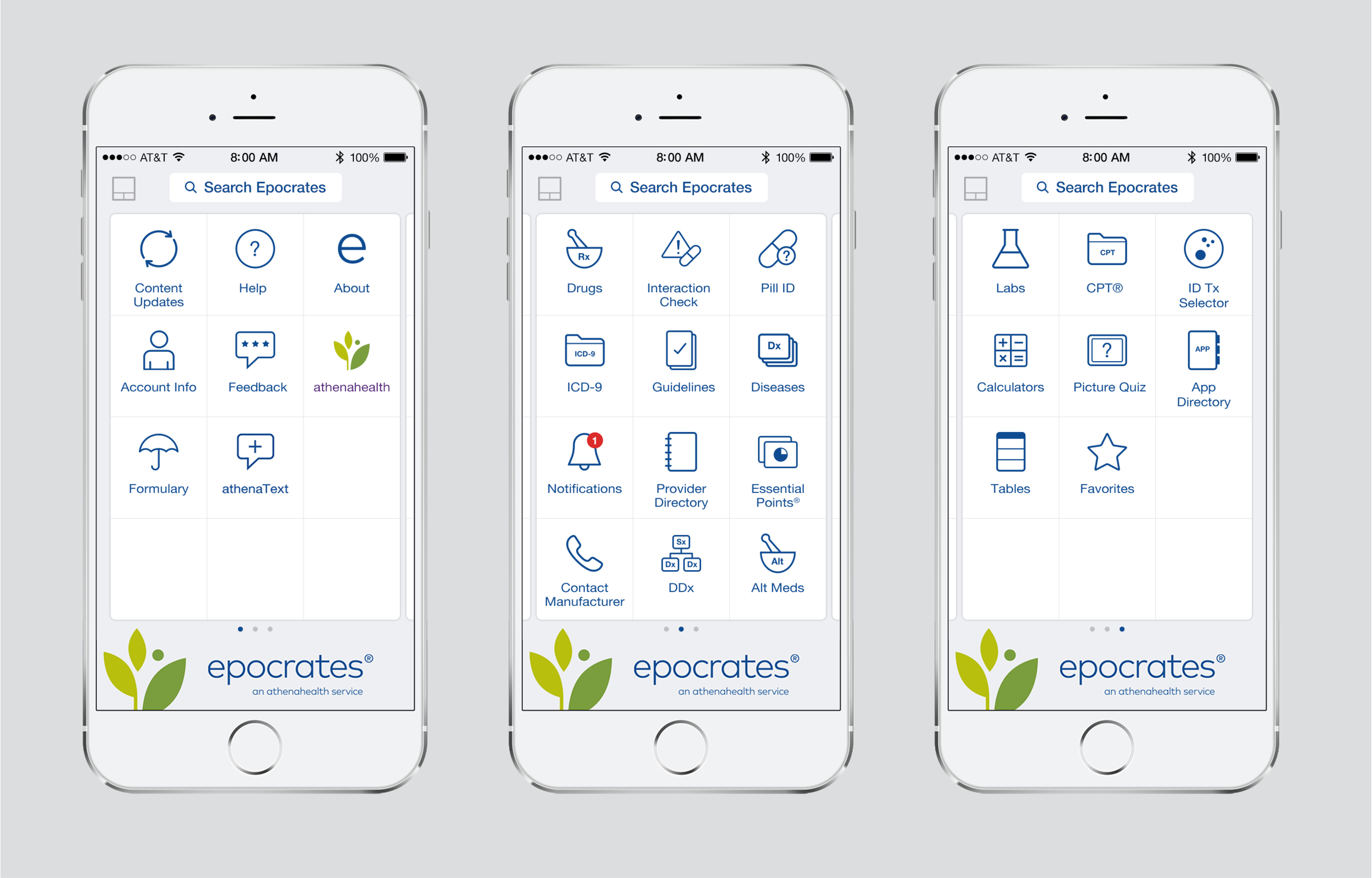
Home Screen Refresh
The main goal for this project was to work together as a team to increase engagement through a well designed user experience.
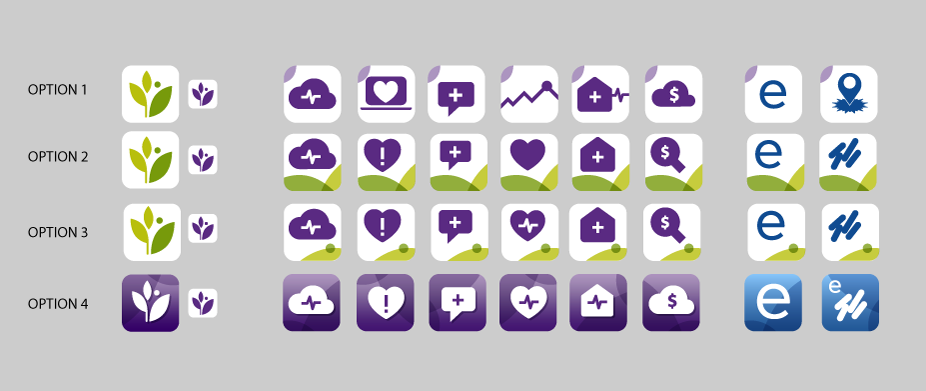
Another part of the process was developing the Epocrates' brand that aligns with athena health's new brand. In order to do this, we explored layout options and icon styles for the home screen tiles. We also aligned secondary icons in the app with the new style. We even added the athena logo and redesigned the app store icons for our entire suite of athena apps.
BRANDING PROCESS
This was the first project we used to start defining the Epocrates Brand. Our team's challenge was to come up with a design for the home screen that utilized the new brand guidelines from Tank Design Agency. We needed to create a new look and feel that was clear, confident, empathetic, and personal. As a product, the user experience needed to demonstrate these attributes: Fast, Intuitive, Integrated, Responsive, Innovative, and Trustworthy.
As part of the process, a Senior UX Designer and I worked closely with our Director of UX to establish the Epocrates brand. Once we established the look and feel, we then collaborated with Product Manager and three Engineers to re-skin the current app.
Team of Seven: Director of UX, Senior UX Designer, UX Visual Designer (me), Product Manager, and three Engineers
Platforms: iOS and Android
Date: 2015
Function: UX Visual Designer
Role: Visual Design, Specs, and Assets
before
The challenge for this project was that we were not allowed to change the navigation. We were only allowed to refresh the icons, colors, and logo. This home screen has tiles as the interaction model. The branded elements also uses the previous logo along with multi-color icons that are too detailed and out of date. We wanted to simplify these icons and make them more modern.

Initial concepts

Exploring iconography
explorations for indicating premium content

Epocrates Plus
This version of the app is a subscription based app that our users pay monthly or annually in order to use the premium tiles, such as Guidelines, Diseases, Alt Meds, DDx, etc.
EPOCRATES Free App
The goal for this version of the app was to differentiate premium content from free content. We indicated the premium features with a direct approach of including locks on those tiles.

Onboarding
We re-branded these onboarding screens with the Epocrate's new logo, the new icon style, and the new Epocrates blue.

App Icons
Our team also defined the look at feel for each app icon that would be presented on a user's phone.
Visual Concepts

Final Design

VISUAL Specs
I was responsible for delivering hundreds of assets for both iOS and Android platforms. I also created design specs for developers translate our design into code.

SCALABILITY
The idea behind this sketch is to demonstrate how the layout would scale across different iphone's. Here we are indicating that the tile sizes and icons do not stretch, but would rather change in how many rows of tiles would be shown depending on the screen size.

Search
In order to increase awareness and educate our user about Epocrates' capabilities, our team improved search by surfacing and promoting related content in the search results.
Search is a means, not an end. Search helps people find what they want, but also helps them discover new content and value in free and plus. We also use search to power and showcase other features and content within the app. Search is also a relationship, not a one-off transaction. Users should know what to expect from search, and search should deliver, consistently. It should be a two-way conversation: give and solicit feedback. Search should learn and adapt over time.
Furthermore, we explored ways to increase revenue by creating new avenues of sponsorship within search results. We considered new ways of promoting existing ads and standardized ads and increasing sponsorship by having more eye balls and clicks on ads.
Our team mainly consisted of two interaction designers and myself as the visual design lead. Together we worked closely to improve the user's search experience. We also developed a clear road map and progression for the future of search through visual representations of different stages. Moreover, we handed off the designs to the developers in two different phases: for Beta and General Audience. Our engineers consisted of both front-end developers for the UI and back-end engineers who developed the server functionality.
Goals
- The top goal of search is to understand, and then meet a user need
- Search must aid in increasing user engagement
- Search must not affect patient safety
- Search should up-sell Plus by educating users about premium content
Team of Eleven: Director of UX, two UX Interaction Designers, UX Visual Designer (me), Product Manager, and six Engineers
Platforms: iOS and Android
Date: 2015
Function: UX Lead for Visual Design
Role: User Research, User Testing, Wireframe Concepts, Visual Design, Specs, and Assets

Research
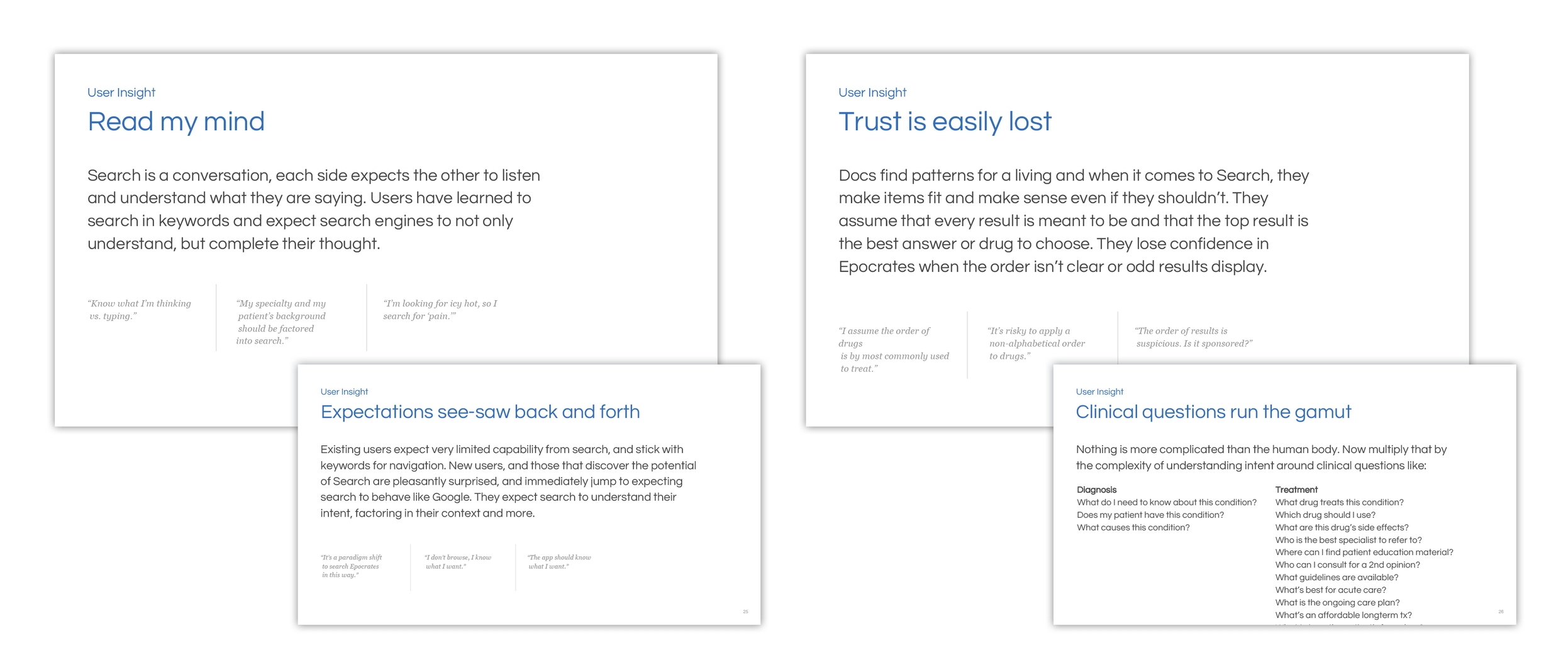
Our team interviewed stakeholders from Med Info, Sales team, UX directors, and developers about our search product and the future of search.
The three of us UX designers administered stakeholder interviews with internal people within the organization. We conducted market research by analyzing various inspiring web search engines and mobile apps that have search capabilities. We researched competitive healthcare companies and apps to develop a comparative analysis. We also investigated current trends in navigation and organization.


Concepts
As the visual design lead on this project, I explored a broad range of wireframe concepts for pre-search, suggestions, results, filtering, interaction models, and clear organization. Thereafter, I develop visual concepts based off the wireframes.

Experience Model Concepts


Revised Wireframes


User testing
After developing concepts, we conduct user testing with six patients for future search capabilities. We created a board of the user's feedback and synthesized them into high level opportunities. We shared our findings from the user research to our partners.


Visual explorations
Pre-Search Concepts

Search Results

Feedback Concepts

Complete Search Experience

Final Designs
Search should be predictable. Users should know what to expect from search, and search should deliver, consistently.
As part of the final design, we implemented the content facets, which also educated users about our premium content. We worked with Med Info to identify the order in which these facets should appear. In order to create a better user experience, we worked with the developers to support spelling corrections, acronyms, and synonyms.
In terms of production, I was also responsible for delivering assets for iOS and Android platforms and creating design specs for developers translate our design into code.
Pre-search, Suggestions, Results
Whereas pre-search allows the users to see their recent searches, suggestions can serve many purposes:
1. Save user time with autocomplete to finish a single word.
2. Save user time and prompt memory with crowdsourced or technical concept autocomplete
3. Remind user with autocomplete, near-neighbor suggestions
4. Help us showcase featured content with add-on suggestions, such as Ritalin and Ritalin adult dosing.

Drug Card, Drug Dosing Card, Disease Card, Alt Meds Card
When the user searches for a specific name for a drug, disease, or alternative medicine, we create this card that has deep links from the monograph, which provide an overview of all information that we offer. This allows the user to quickly access information without having to dig for information. Furthermore, we created these cards in order to surface existing content and educate our users about the plethora of information on the subject matter. Ultimately, this might help our users diagnose their patients faster in the moments of care.

Spelling Corrections
One of biggest pain points we found during user testing was that most doctors would mis-spell words, even common drugs and diseases. Because our system did not support spelling corrections, often times the doctors could not find what they were searching for until he or she corrected the spelling.

Acronyms and Synonyms
Search should be synonym-agnostic. Another usability issue we discovered was the fact that we did not support common doctors lingo. Doctors frequently use acronyms for specific diseases, such as HTN for hypertension.

Feedback
Make it a two-way conversation: give and solicit feedback.
Feedback is essential to improving search. In order to create a better user experience, we created a feedback section for our users at the end of each search result. Our concept behind this was to use the pain scale to indicate the user's level of satisfaction with the results received for that particular query.
